
Orange Township will phase in a new branding campaign in 2019 that officials hope captures the township’s strengths of outstanding schools, natural landscapes, safe neighborhoods, and most of all, its family-first community atmosphere.
According to township officials, the $24,500 project, which arose from the township’s comprehensive plan, was kicked off in June with extensive research, surveys, and focus groups to build a brand foundation and strategy before creating the logo, brand palette, guidelines and design applications.
“We believe our brand is embodied in the people of Orange Township, so our process was built with community input and feedback,” said Lee Bodnar, township administrator. “The process confirmed that many of the citizens we serve hold great passion for the community we share, so their input upfront in the process was not just helpful; it was enlightening as their feedback indicates that we are on the right path.”
Bodnar said the township plans to roll out the new branding in phases, updating the signage and materials on an as-needed basis to manage the further costs of the project and to allow for a more thoughtful transition.
According to trustees Lisa Knapp and Deb Taranto, the rebranding of the township had been discussed several times over the years, but no action was ever taken until Trustee Ryan Rivers spearheaded the effort.
“We’re enjoying a boom in growth, which is really exciting,” Rivers said. “The brand development we’ve completed helps us articulate our identity, so as to support thoughtful and intentional planning and strategies for the future. It’s like a launch pad we can all use when communicating our township’s great traits, and it does it in a way that is authentic to who we are. Our new branding celebrates and highlights our best attributes.”
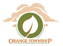
Knapp said the current logo, which was created nearly 15 years ago, was done so without input from township residents. She added the demographics, lifestyles, and general makeup of the township have changed since that time.
“We have found that Orange Township did not have a defined identity with many residents assuming they live in Powell, the non-existent city of Lewis Center, or even Delaware,” she said. “At the time, it was a good start. However, it did not help to create an image or to define Orange Township, and it did not really identify the various facets of Orange Township, which the township would now like to highlight.
“All trustees were in agreement and approved the branding process as well as the payments,” Knapp added. “For consistency, to recognize the heritage of Orange Township, and to avoid excessive costs to the township for upgrading, the new logo incorporates the colors of the old logo, and it will be phased in gradually.”
According to a press release from Guide Studio, a brand development and communications planning firm for civic entities in Cleveland, the branding process began with a steering committee comprised of residents, key township staff, and members of the Orange Township Board of Trustees.
Guide Studio’s job was to collect feedback from a broad cross-section of the community through a variety of workshops, focus groups and public surveys, and then to assist in identifying a brand and craft a campaign through a comprehensive strategy of key messaging, communication and a logo.
“The discovery process taught us that Orange Township is home to many families where both parents are working,” said Caroline Chaikin, Guide Studio communications director. “We learned that residents are here because it not only helps them balance a busy lifestyle, but it also helps them to maximize time at home with their families. We recognized the fact this balance can be uniquely found within the township’s borders, so we knew any resulting brand identity must celebrate this quality.”
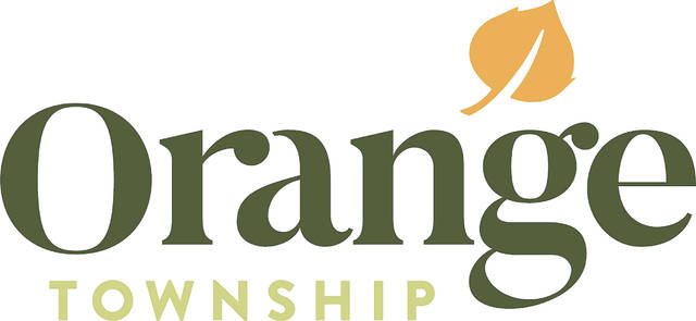
Guide Studio’s press release states, “Based on community input, the township’s new logo was designed with an emphasis on the community’s friendly and welcoming culture. It also recognizes the township’s previous brand as it maintains the recognizable Aspen leaf that is indigenous to Central Ohio with a color palette that represents the natural landscape and complements both the township’s name and its beautiful fall foliage.”
“It’s not just a logo or slogan, it encompasses more,” Taranto said. “It’s really good for Orange Township. It’s something to be proud of.”
Knapp added, “I believe the new, modernized, and fresh Orange Township logo is indicative of the township’s new direction towards a bright future.”
The new branding was approved by trustees in December.


